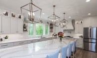
Amy and Charles Roberts have played the field—in looking at homes, that is. With three boys, their family was growing out of the current space, a brick rambler. They loved the location of their house, with its proximity to downtown. “We had plenty of living and family space,” explains Amy Roberts. But the bathrooms were another story. The master bath was so small, “two people couldn’t be in there at the same time,” Roberts says, so the boys and Charles used the small hall bath, outfitted with a single chipped sink and dilapidated drawers. “It got to a point where we didn’t want people to visit us and use the bathroom.” The Robertses went house hunting. They visited house after house, and checked online listings, all without luck. “We realized that any house we moved to would need modifications,” Roberts says. That’s when inspiration struck. Why not just modify their existing house instead of moving? “We were scared to take the first step to renovate, because we weren’t sure how much it would cost,” Roberts says. For families like the Robertses, “I think it’s best for everyone to have a grand plan and then do the work in phases,” says Laura Orfield-Skrivseth, co-owner of Orfield Design & Construction, Inc. One of the top priorities for the Roberts family included renovating the bathrooms, as well as the main hallway so that there weren’t such myriad brown, hollow doors. What took precedence, however, was the front entrance—a monolithic brick structure with antiquated white metal railings—as here lay a persistent leak that refused repair through other methods. “It felt like climbing a castle wall,” says Orfield-Skrivseth of the exterior entrance. To remedy the structural issue and create a home with more curb appeal, the entire top of the concrete landing was removed. Updated black railings were added, as were trim boards and an additional window. The Robertses also imagined an addition to their home, allowing for larger bathrooms and more space in the master bedroom. With an eye on the budget, Orfield-Skrivseth suggested instead a “cantilevered master suite addition, then they save the cost of adding a whole foundation.” As a result, the previously 193-square-foot master bedroom, with its small, sliding doors closet, is now a 415-square-foot suite with a roomy walk-in. The bedroom is spacious, even with an elliptical machine and a small desk space set up beneath one window. As for the master bath, “The whole family can fit in here now, not that we need them to,” Roberts says with a laugh. The hall bath is spacious enough for the boys, ages 6, 8 and 10. With dual sinks, a roomy shower and renovated storage space, it’s a vast improvement. And stepping into the hall is now an invigorating experience thanks to the brightening and opening up of the space; Orfield-Skrivseth eliminated the need for two of the doors and replaced the remaining mismatched wood tones with white enameled doors. The Roberts family is looking forward to the next phases of renovations—adding a bathroom and an outside deck off their kitchen, then tackling the downstairs laundry area. “I don’t want to be saving forever for the perfect house,” Roberts says. “I want to live here and enjoy it. I don’t want the kids to be in high school before the home is what we need.” & More Local Resources General contractor: Orfield Design & Construction Inc. Tile material: Tile X Design in Plymouth, tilexdesign.com Neo-angle shower door and glass panels: Minneapolis Glass Co., minneapolisglass.com
Menu
From the July 2013 issue
Revived Rambler near Plymouth
One family’s story about taking that leap of faith into a complete home remodel.
A big upgrade in the Roberts family's remodel was a simple one: unifying the varying browns of different woodwork with clean, white trim and doors.


